The #1 Mistake You’re Making While Sampling Wall Paint
If only it were as easy as slapping some paint on the walls and calling it a day.
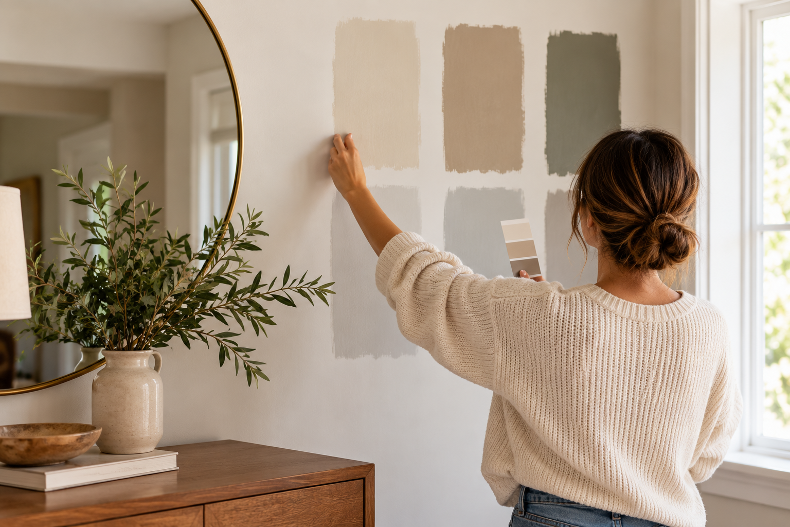
Sampling should be as easy as bringing home a paint pot and getting it on the walls.
But there are some things to know if you don’t want to overlook what could be the right color for your space.
So today I’m sharing a quick tip that will save you time and energy (and confusion) using my recent bathroom refresh.
Are you ready? Do not sample your wall color over your existing wall color…unless it is already white.
Why? Because you’re never going to see the true color be accurately reflected in your space otherwise.
To get started, let’s look at a common example below and pretend you want to update your millennial gray walls with warmer neutrals.
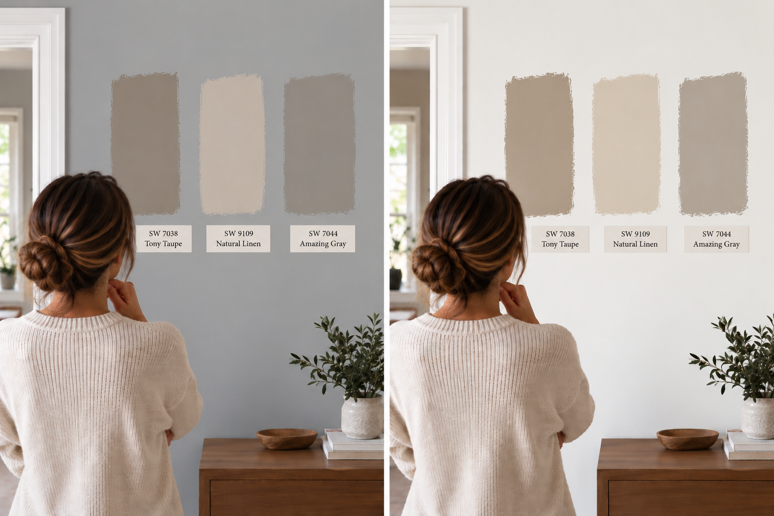
While this is a digital mockup, this is an accurate example of how your existing wall color will influence the way your wall samples look.
Take a second to really see how the three colors look different on each wall.
With the grey walls, your neutrals just look muddy and it feels unclear how light or dark they really will be. I also can’t see the undertones properly because my eyes are picking up contrast only.
Especially because there is a cooler blue-grey wall, I’m going to see the warmth more pronounced which could influence my decision to pick a color if I don’t like the warmth I’m perceiving.
We can really only see the colors with a white background. I really encourage my clients to pick up a sample of a true white paint color (like Pure White SW 7005) so you can do a coat before sampling, or paint a sample on a piece of paper.
Now, let me show you how this played out in a bathroom I did; you’ll see just how much colors can be manipulated by the existing wall color underneath.
This is the color I was going for to match the countertops & floor.
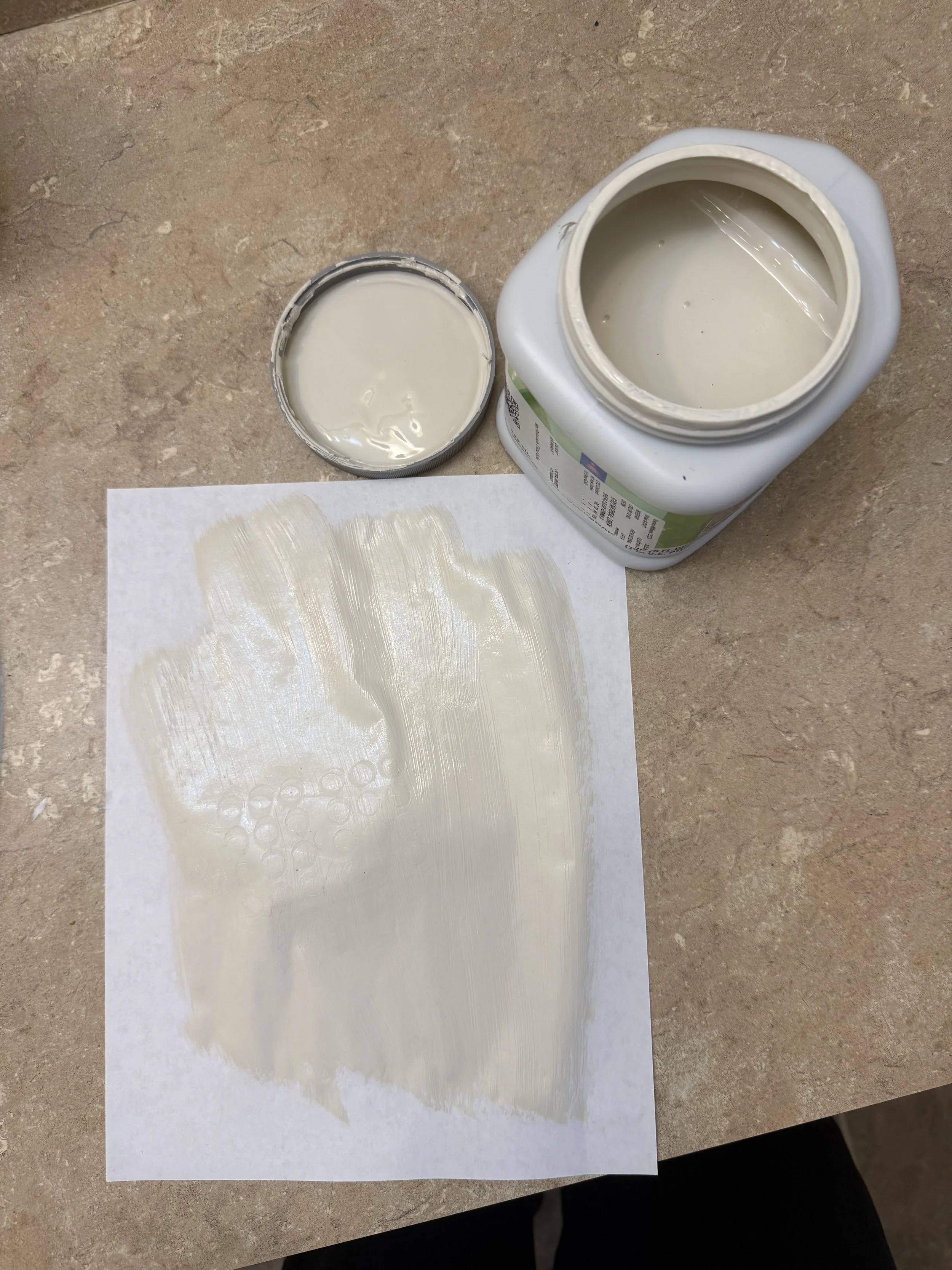
Natural Linen SW 9109
You can see it’s a light, creamy beige color.
Now, look at how it looks against a very peachy wall.
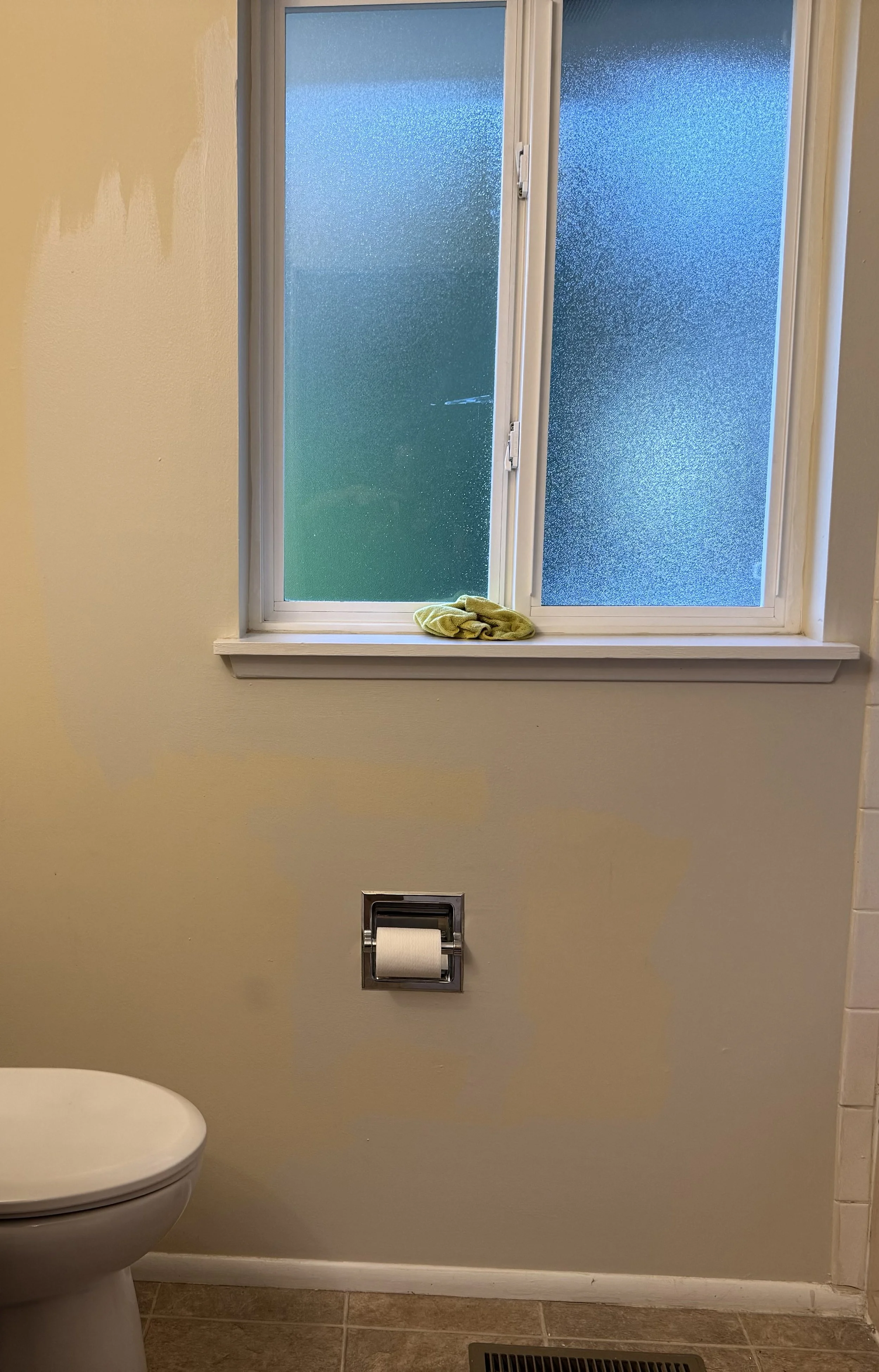
All of a sudden it looks silver with a blue tint…
I’d have passed on this color so fast if I didn’t know that the peachy orange wall color was affecting the way I was interpreting the color.
But now look at this and how spooky this is (and why you need to paint a piece of paper and hold it against the wall).
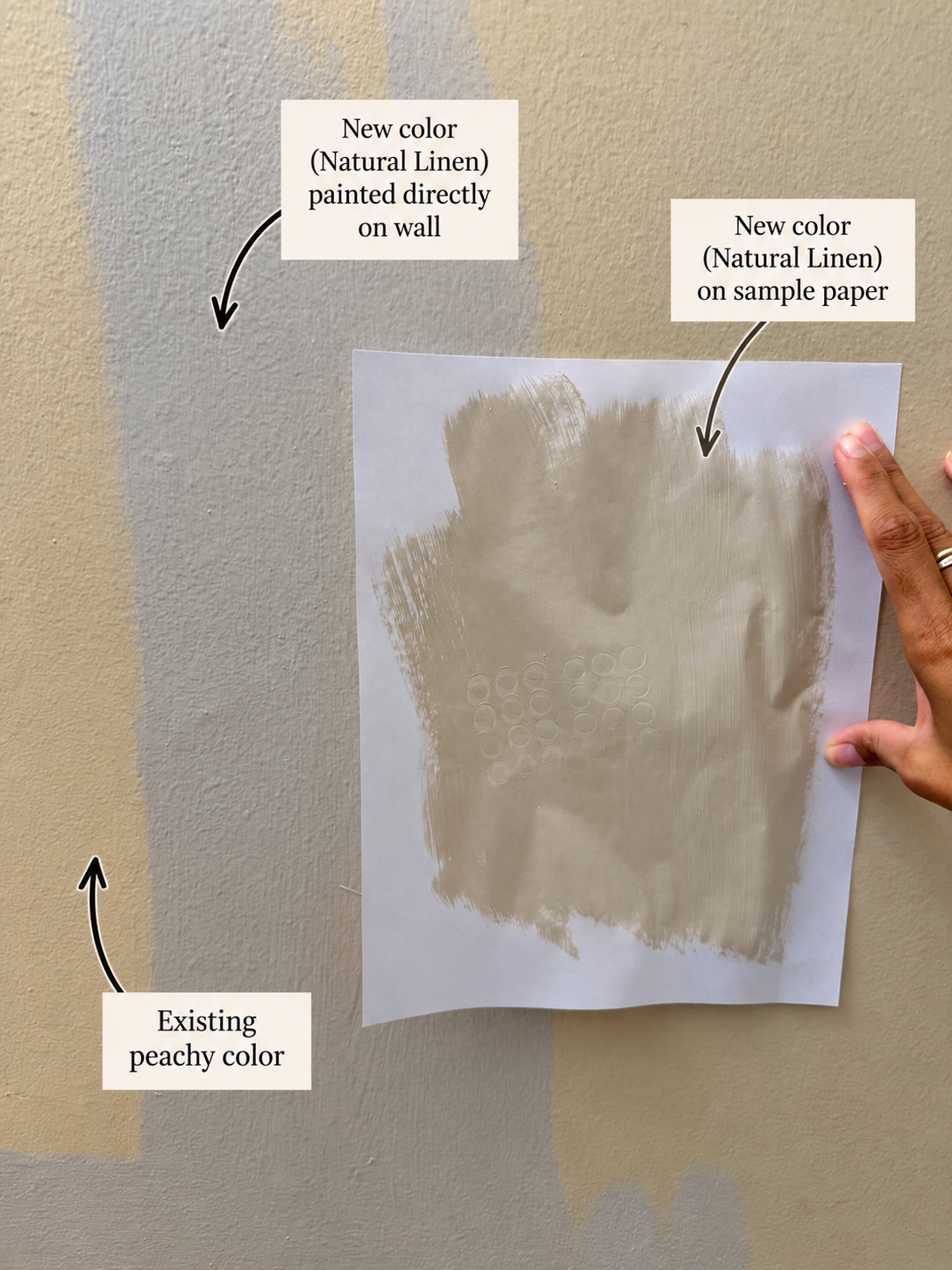
I’m literally doing a side-by-side of the same color both directly on the wall and against a white piece of paper.
THEY LOOK SO DIFFERENT!
Okay, last example just to tie this all together.
Here is the wall sample side-by-side of the fully painted wall just so you can see that even though you paint a large part of the wall, you’re still not seeing the true color you’re painting because it’s still being affected by the existing color.
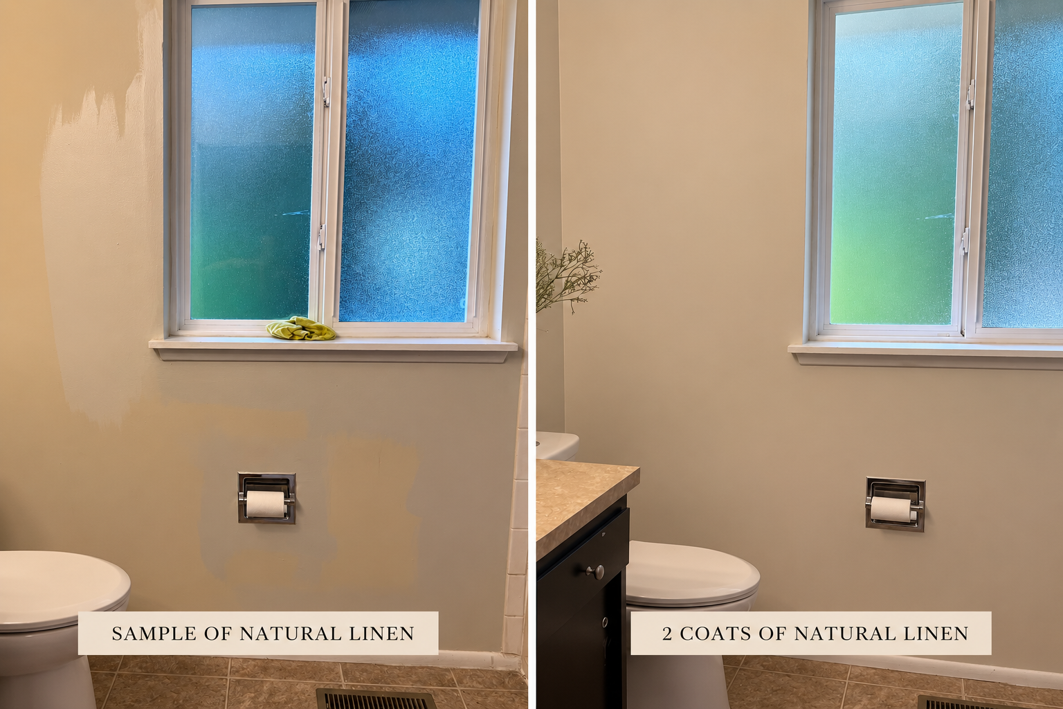
Looking at these two side-by-sides, would you imagine that the image on the left is the same as the one on the right?
I wouldn’t, I’d think I’d chosen a very blue-tinted light gray which is not what I was going for.
We need to use a piece of paper to sample our paints, or paint 2 coats of white before sampling.
I love this color so much and it creates such a cohesive space to marry the countertops with the flooring to make it feel fresh. But had I not known this important tip I’d have passed on it, and maybe passed on all the colors because anything against these walls would be an uphill battle!
Thanks for reading and happy painting!

Hi! I’m Nancy!
And I’m here to help you choose paint colors for your home without all the stress. If you’re in the Seattle area, you can book an in-home color consultation with me.